@akelataka
Akela Taka

The Prophet Mouse
The Prophet Mouse by @akelataka (Akela Taka)

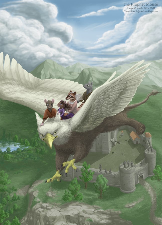
A cover for Jonathan Grynspan's book The Prophet Mouse (http://www.prophetmouse.tk/).

Category:
Rating:
Everyone
Class:
Finished Work
Submitted:
20y27d ago
Tags:
None
Other Work By @akelataka

Comments & Critiques (7)

Preferred comment/critique type for this content: Any Kind

Posted: Saturday, 03 April, 2004 @ 02:38 PM

Good lord, that is beautiful. The background really blows me away... It really gives the impression that they're soaring. The characters themselves are also looking good. The gryphon's back leg looks a tad short.

Posted: Saturday, 03 April, 2004 @ 02:53 PM

You've FLOORED me.

Whatever you did to make them seem so much higher than the castle--it WORKS. RIDICULOUSLY WELL. And every character has an interesting expression--my fave is the racoon. Fantastic piece: teach me how to paint rocks. ;)

There are some nits I have...The people on the castle should be smaller, I think. Right now, it looks like the crenellations only come up to their knees, and in midieval times, those usually came up more to their chests. Right now, the li'l folks dont' look like they could fit inside their castle.

Second, I think the shading would be a little more vibrant if you'd used complementary color for shading...Right now, the pic is a little greyed out.

But dang--your technical skill here? MARVELOUS. (applause.)
Posted: Saturday, 03 April, 2004 @ 03:18 PM

Thank you very much for the comment. It always helps me when people say more than just "wow, I love it" - I get loads of comments such as this for every piece X-D

You are absolutely right with the size of the people in the castle. And the shading? Oh well, I am not able to use complementary colors for shading yet, but I'll try to learn it somewhere! I have read just a few tutorials about it, but I still wasn't able to learn how it works in real :) I never visited some art classes or something and I really miss it now :)

Posted: Saturday, 03 April, 2004 @ 04:54 PM

It's actually not that hard: I do it in digital all the time. Want some help with it? I could probably do a quick paintover for you, if you want...or we could start off with a li'l sphere or something. And I have some tutorials too, though you might've already seen 'em.

Posted: Sunday, 04 April, 2004 @ 01:05 AM

I'd be very grateful for any help! Quick paintover would be really helpful, and if you can recommend me some tutorials for digital painting, please do so :) Thank you very very much!

Posted: Saturday, 03 April, 2004 @ 07:11 PM

And here, I thought it was going to be a bit of Rescuers fanart. Well, glancing at the thumbnail, its got a couple mice riding an eagle. It fit.....

Very, VERY nice. Amazing texturing. In the grypon, as well as the background. And I like the design of the furs. They're like I've always pictured Redwall-type furs.

I like how you've done the arrows. But as has already been pointed out, the archers are a a bit out of scale. They look about as tall as the castle gate. (And great job on the castle, by the way. Looks like you spent some time researching them. Only quibble is that its so empty. The well and other building are nicely done, and the interior grass does looked trampled down, but its still pretty much blank. I'd kinda expect it to be littered with stables and supplies and stuff. But I understand that that's really nitpicking.) ;)

takes step back, whistled .....yeah. I'm impressed.

Posted: Saturday, 03 April, 2004 @ 07:41 PM

I first saw this and thought 'Redwall!!' but then remembered there are no gryphons in Redwall o_o Either way, it's an amazing picture. I love the perspective with the arrows especially. And how you made the rocky mountains and grassy fields to be sooo...rocky and grassy! xP You are just getting better and better at backgrounds and landscapes. lovez

Leave a Comment

You must be logged in and have an Active account to leave a comment.
Please, login or sign up for an account.

What kind of comments is akelataka seeking for this piece?

  • Any Kind - Self-explanatory.
  • Casual Comments - Comments of a more social nature.
  • Light Critique - Comments containing constructive suggestions about this work.
  • Heavy Critique - A serious analysis of this work, with emphasis on identifying potential problem areas, good use of technique and skill, and suggestions for potentially improving the work.
Please keep in mind, critiques may highlight both positive and negative aspects of this work, but the main goal is to constructively help the artist to improve in their skills and execution. Be kind, considerate, and polite.