@Claidis
Lauren Rankin

Spring Dance
Spring Dance by @Claidis (Lauren Rankin)

I had intended it to be a renaissance dance picture but, back then you could show as much cleavage as you wanted but it was highly innapropriate to show your ankles or legs. I keep doing the snouts wrong on these lupine pictures; definitely need more practice. And, as usual, some bleaching from the scanner, but that's probably for the better considering the only good pink marker I have is too saturated/bright pink.

The background gave me a lot of trouble; I kind of regretted doing a tree because it turned out to be such a pain in the rear! White-out helped though, to give it somewhat of a blossomy look.

Category:
Rating:
Everyone
Class:
Finished Work
Submitted:
19y75d ago
Tags:
None
Other Work By @Claidis

Comments & Critiques (2)

Preferred comment/critique type for this content: Any Kind

Posted: Friday, 11 February, 2005 @ 12:30 AM

Impressive . . . good shading, good effects on the tree, excellent portrayal of motion through pose and the position of the ribbons . . .in fact, there are only two critiques I can offer for this. 1. Their cheeks look a bit pouchy. Not the best way to describe what I'm trying to say, but I think you know what I mean. I think their snouts look fine. 2. The leftmost dancer's chest looks a little . . . off. I'm not sure how, exactly, but it doesn't look /quite/ right. All in all, though, a very good job. Keep it up!

Posted: Friday, 11 February, 2005 @ 08:40 PM

Thank you for the honest critique, I appreciate it.

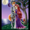
I suppose I know what you mean about their cheeks now. It was only after I consulted my boyfriend on the way they look that I got some more honest feedback. They were supposed to be wolves, and he's like..."Uh, no, they look rodent-like...their ears need to be more slung back, and their cheeks are too pouchy." me: "........?!?!??!?!" NUCLEAR MUSHROOM CLOUD hehe, I guess I still need a ton more practice with those kinds of forms. As for her chest, I know what you mean---it was a flaw even I could see, but one I didn't realize was there until after I inked it. The left breast needs to be moved over towards the arm more; they're too close together. I have a bad habit of doing that as far as female chests go.

Anyway, thanks for the comment!

Leave a Comment

You must be logged in and have an Active account to leave a comment.
Please, login or sign up for an account.

What kind of comments is Claidis seeking for this piece?

  • Any Kind - Self-explanatory.
  • Casual Comments - Comments of a more social nature.
  • Light Critique - Comments containing constructive suggestions about this work.
  • Heavy Critique - A serious analysis of this work, with emphasis on identifying potential problem areas, good use of technique and skill, and suggestions for potentially improving the work.
Please keep in mind, critiques may highlight both positive and negative aspects of this work, but the main goal is to constructively help the artist to improve in their skills and execution. Be kind, considerate, and polite.