
I KNOW!! Isn't it a SHOCK?!! Though I'm kinda behind on my February picture... Gotta get to work!
Thanks for the compliments... ^-^
@smarle
Staci/Nadia

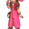
I'm doing a sort-of calendar for 2005 of top images for my website involving Chrono Trigger, and this is the non-calendar version of January's picture! It's Magus and Alfador on North Peak from 12,000 BC, since that time period is the Ice Ages, and January is a snowy month...
It took probably about 4 weeks or so from getting the idea to actually having it finished.. ^^;;; I was pretty lazy with the holidays and going out kinda frequently lately with Red... I don't really like how Magus looks in his official art, so I tried to make him look a little better... ^^;;; Drawing his hair and cape blowing in the wind was fun! And kitties are such cutie-poos...
Most of the picture was colored with Prismacolor and Kodak colored pencils. I got a lot of use out of my Prismacolor blender to make the colors look smoother. The ground of the peak was done in Photoshop, along with some slight editting.
The background is very simplistic, and I forgot to shade the clouds and draw in Alfador's whiskers... ^^;; Plus Magus' hair is purple instead of blue... ^^;;;; But it's still a warm and fuzzy kind of picture, ne?
Preferred comment/critique type for this content: Any Kind
I've been very poor about commenting for a while now, sorry about that.
As goes without saying, I'm heavily biased when it comes to CT, but...I really do love this. Alfador is veeeeeeery cuuuuuuute and Magus' design remains pretty accurate and you took away the feakness of his facial features. I think in doing so you made him look a touch feminine, but honestly, I would have to say that's an improvement anyway. The skin and hair colors are my biggest gripe, I would have to say...those I would've liked to see kept closer to the originals.
At any rate, awesome shading job as always, especially on the hair!
The other big thing is the background. And I'm glad you did one, and it is certainly apparent this is at the cape (nice shadow as well, BTW) but I wish the sky didn't look colored every which way. A solid CGed blue would've looked better, if simpler.
Overall, as I said, I love it. And I'm really eager to see all your other CT images this year. This is sure to be a fine dedication to CT when they're all done. Happy decennial, Chrono Trigger!
No worries--I slack off every so often myself... ^^;;;;
I don't draw men too often, so it's pretty understandable for Magus to wind up a little feminine-looking... ^^;;; Or maybe it's just my style...? But with that hair, he'd have to be a bit pretty, I guess, LOL... I probably shouldn't have been lazy about fixing Magus' hair color in Photoshop, but I was afraid of massacring it, so I just left it as is... ^^;; It was HARD to pick out skin colors... He actually looks like he has a small bit of stubble, LOL, with the gray shadow. Probably would've had an easier time had I Photoshopped the whole picture... Oh, well... ^^;;
Yeah, the background is pretty crappy... ^^;;;; Something else I need quite a bit of work with...
Thanks for the nice comments... ^-^
Gotta agree with Janus, as far as the background is concerned and all. Love the fact that it's there, but a little more work on making sure that the marks look more uniform or nonexistant would help quite a bit. But, to be fair, crayons only help exacerbate a problem since I find that they tend to skip on me a lot as well. Depending upon the size of the original picture you could have easily gone through one or two of the same crayon just to make sure the color was uniform throughout.
Also, the pencil or pen outlines for the clouds tend to stand out a bit more than they otherwise would, so you may want to be careful about that. Finally, Magus's hair should be blue, but that's more of a minor gripe more than anything else.
Otherwise, the pose is a great one, the setting is pretty much obvious on its own, and the fact that there's a background makes an outstanding difference!
Yeah, it was definitely a pain trying to fill in such a large area with a Prismacolor pencil and try to get it to look smooth... If it's any consolation, it looked even worse before I used the blender pencil... ^^;;;; Those really do help... Though, I do think it was probably a bad idea to use pencils instead of markers for that in hindsight.
As for the clouds, do you recommend using blue ink as opposed to black for the outline for something like that? I usually just use blue ink if blue is the predominant color of the image...
Thanks for the great and helpful comments!
Woohoo! A January calendar image -- IN JANUARY! You go, Nadia!
I really like your take on Magus. He doesn't look like the ugly Toriyama version, but he doesn't look "pretty" either. You struck a good balance and stayed true to the design! Plus, I love the idea. Magus/Janus's relationship with Alfador is one of my favorite friendships in the game.
I can't wait to see your February image! =D