
Thanks! :D Coloring metal's pretty fun, though I color silver a lot more than gold, I think... I loved doing the boots, too! I tried to make them shiny, especially when I was redoing them in Photoshop...

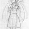
Grand Diviner by @smarle (Staci/Nadia)
This picture was finished back in February, 2001. A sexy picture of Angela in her Grand Diviner costume! The sketch itself had turned out really well, and I'd left it in my sketchbook for quite a few months before inking and coloring because I was so afraid of ruining it... ^^;;;; I colored this with my Prismacolor markers, but I didn't like how the hair turned out and my scanner turned all the shades of red into one color, so I had to do a bit of fixing up in Photoshop. I'm really happy with the result! I'd actually intended for this picture to the be the first of a series of all the characters in their various final class costumes, but I haven't drawn any more of the classes though I do have a started sketch of Riesz's Fenrir Knight costume.
Comments & Critiques (8)
Preferred comment/critique type for this content: Any Kind
Posted: Wednesday, 27 August, 2003 @ 02:18 AM
This picture's great! The CGing is especially well done, with good lighting effects and textures! I especially like the way you colored the metal parts of her costume, they look really shiny and cute. And the face is seductive and charming, just like you'd expect Angela to be. The hair is also very well done, it's glossy and very pretty. The only negative thing I have to say is that her face seems a little fat like in many of your pictures. That might be something to work on in the future. All in all, though, it's excellent!
Posted: Monday, 22 September, 2003 @ 10:08 PM
Thanks! :D As I mentioned above, the metal and shiny textures were fun to work with! I think the hair turned out glossy because of the Photoshop airbrushing on top of the marker. I didn't think it turned out so well, but I'm glad you liked it... I think her face wound up fat here because I messed up on her left (right in the picture) ear position... O_o;; Maybe I do that too much and that's why my faces look fat... I'll have to work on that... ^^;;;
Posted: Monday, 22 September, 2003 @ 01:34 PM
I rescind the always cutesy comment from earlier, you can do non-cute when you want to. ;)
The first time I saw this I was really impressed, I think it was probably the first marker work you showed me. I agree with Aaron that perhaps the face is a little wide, especially given how skinny her arms are, but otherwise it's good and the coloring is well done. Do moooooore. :D
Excellent job, Nadia! Great work on the coloring, especially on the metal parts and boots. They have a lot of texture to them. ^_^ You really ought to CG more, you seem to have a knack for it...even if in this case it's mostly post-production.