@Anrui
Jessica Holden

Self Portrait
Self Portrait by @Anrui (Jessica Holden)

Self portrait done for my Drawing class. My professor said it was the best in the class, however there are some things I'd like to work on still. Need to increase the contrast a bit to define the hands a bit more, and the shading on the face is hard to see and makes it look flat. I'd also like to work on the background a bit more (it was rushed; I ran out of time) and fix the shirt. Critiques are very welcome.

Carbon pencil on Stonehenge paper.

Category:
Rating:
Everyone
Class:
Finished Work
Submitted:
19y147d ago
Tags:
None
Other Work By @Anrui

Comments & Critiques (7)

Preferred comment/critique type for this content: Any Kind

Posted: Friday, 17 December, 2004 @ 03:01 PM

That is really great! I couldn't draw that til the end of the end! Thats forever!

  • words from a song on spongebob
Posted: Friday, 17 December, 2004 @ 03:09 PM

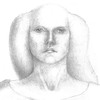
The face is amazing. It shows me a slightly dreamy woman with artistic ability--I'm not sure how, but even if I didn't know this was a self-portrait, i would feel this woman was an artist. The cloak is very, very well done, and the folds of the shirt and the hair are also nicely done, I feel it's the arms and how the things all interact that's the problem--

You see, everything here seems divided into seperate parts--hair, clock, skin, etc. And it doesn't blend that well--don't be afraid to blur the distinctions between the things, don't worry so much about every little detail--the most important thing in art, I think, is getting the IMPRESSION across, not the acuracy. that's what photos are for, I feel. You've done a great job in getting the emotion and expression in the face without relying too much on how things are, exactly... Am I making sense? o.O I've studied realism but to be honest I'm not very good at it, so maybe I'm not even qualified to give advice--but as an observer, this is what I feel is mising. This is a really lovely piece, and I hope someday you have it finished to your own tastes and desires!

Posted: Friday, 17 December, 2004 @ 03:29 PM

Thank you, your comments are very helpful.

What you suggested is exactly what I want to try to fix, though the separation doesn't seem to be so extreme in the actual drawing. I'll have to try to get a better picture of it when it's completed. Unfortunately, it's much too large to scan.

Posted: Friday, 17 December, 2004 @ 06:20 PM

Really well done! rate 10 on 10....the glass is very believable

Posted: Monday, 21 February, 2005 @ 09:21 AM

Very nice picture! I would like to point out that I detail you have on the top/dress is very nice, the creases are very evident and the lighting is where it should be~

Liliwagn is right with the distinct-ness, I would probably suggest you add s slightly darker skin shadow to help blend the colour? It is only a suggestion, but that's what I usually do, because technically, it's from under the cloak, so shadows should be present~ More/darker shadows can probably give it a more 3D effect too!

Overall though, this is amazing and very realistic! XD Very nice portrait!

Posted: Wednesday, 23 March, 2005 @ 12:12 PM

Lovely self-portrait - definitely wonder what she's (you're?) thinking! Love the way the fingers are gently wrapped around that glass, especially. Very delicate.

As for suggestions, I third the vote on the separateness of the elements - they're all quite marvellous by themselves, but right now there are three distinct objects - cloak, dress, you.

I think that's mostly due to the values you used for each - very dark for the dress, midtones for the cloak, almost all very light for the skin and hair.

There are bits that could be darkened - hair behind neck, deepest shadows on skin - those might benefit from being made a bit stronger...and the highlights on the dress could be a wee smidgen lighter...to bring the whole more 'together'...though I agree keeping the face fairly light could help keep it the focus of the drawing...

In the end, though, it's your portrait after all, and I'd never presume to know anything about (a) graphite, and (b) portraits, so feel free to anything I say with a pinch of salt! :)

Posted: Wednesday, 23 March, 2005 @ 03:13 PM

Thank you for the wonderful comment!

I am going to try to bring it all together more once I have time. It had been done for a class and the requirements of it are what led to each element being very separate, unfortunately. It doesn't help that my boyfriend's camera doesn't pick up the lighter values well. They are a bit darker in the actual drawing.

Leave a Comment

You must be logged in and have an Active account to leave a comment.
Please, login or sign up for an account.

What kind of comments is Anrui seeking for this piece?

  • Any Kind - Self-explanatory.
  • Casual Comments - Comments of a more social nature.
  • Light Critique - Comments containing constructive suggestions about this work.
  • Heavy Critique - A serious analysis of this work, with emphasis on identifying potential problem areas, good use of technique and skill, and suggestions for potentially improving the work.
Please keep in mind, critiques may highlight both positive and negative aspects of this work, but the main goal is to constructively help the artist to improve in their skills and execution. Be kind, considerate, and polite.