Wow thanks :)
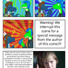
Actually each color represents one of the 6 characters.. I'd wish I could make it even more symbolic somehow
@Farel
Jan Nowak

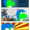
Hmmm well this is the logo/cover. Why is the first chapter's title "The First Chapter"? Cause I didn't come up with any better title!
.... you like the logo?
I like the sense of movement in this logo and I think the color choices work very well together. I would like to think that each color has some form of specific meaning. The blue seems to have a light disconnection between the inner and blue and the darker border. I don't know if that is intentional or not. I really like the way that the highlight and shadow is handled in the grey section of the logo it gives it almost a three dimensional feel to it.