@Valesse
Internal Conflict

Bren Bren at Din Din
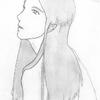
Bren Bren at Din Din by @Valesse (Internal Conflict)

I would say that this is finished if I didn't hate it so badly. There is something missing about the chest region and it isn't another shirt. hmpt. In other news, the rose and the hands are peeeerfect, and me loveles them greatly. The end!

Category:
Rating:
Everyone
Class:
Work-In-Progress
Submitted:
20y176d ago
Tags:
None
Other Work By @Valesse

Comments & Critiques (1)

Preferred comment/critique type for this content: Any Kind

Posted: Thursday, 27 November, 2003 @ 09:22 PM

Excellent, EXCELLENT shading in this piece! It's absolutely magnificent! The character's pose is very nice as well, but I do agree with you on the chest area--it needs more lines. Try looking at one of the How to Draw Manga books--even if you try to go for a more humanoid than anime style, they are very helpful when it comes to simplified anatomy. I also think a bit more of a background would work well on this--the white space is a bit much and distracting. Oh! And don't forget to keep your lineart sharp. Don't let it blend in too much with the pencils!

Leave a Comment

You must be logged in and have an Active account to leave a comment.
Please, login or sign up for an account.

What kind of comments is Valesse seeking for this piece?

  • Any Kind - Self-explanatory.
  • Casual Comments - Comments of a more social nature.
  • Light Critique - Comments containing constructive suggestions about this work.
  • Heavy Critique - A serious analysis of this work, with emphasis on identifying potential problem areas, good use of technique and skill, and suggestions for potentially improving the work.
Please keep in mind, critiques may highlight both positive and negative aspects of this work, but the main goal is to constructively help the artist to improve in their skills and execution. Be kind, considerate, and polite.