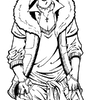
Your hard work shows! I like the textures you used, especially on the pants. This looks like something Hikaru would wear. I also like the pose! You draw good hands. Nice job all around!
")
Hikaru (Finished) by @mooch (Jessica A. Kadikoff)
Colored version. It took forever, and now I'm going to bed, this is my favorite picture that I've EVER done. (:
Category:
Rating:
Everyone
Class:
Finished Work
Submitted:
16y334d ago
Tags:
None
Comments & Critiques (9)
Preferred comment/critique type for this content: Any Kind
Posted: Friday, 08 June, 2007 @ 11:45 AM
Beautiful work here. It's really well done, and the lighting is really well thought out.
The one thing that catches my eye as problematic are the textures. While they add a nice value to the image, they look flat when they should be curved around the three-dimensional surfaces. Folds are drawn in the fabric, but the textures don't match those folds. It's a difficult problem to deal with.
I've used successfully a tutorial that helps with that problem when using textures. You can find it here: http://www.polykarbon.com/tutorials/displacement/displacement.htm
Otherwise, FANTASTIC image.
Posted: Friday, 08 June, 2007 @ 12:21 PM
yeah, i'll admit I was lazy there because the picture was taking so long and I worked the next day, but I HAD to finish XP I'll take a look at that tutorial, thanks!
While noticing mistakes, I also hate to bring up his right leg. It's very thick, (Shown through the tears) and I should have either made the leg thinner or the pants baggier >.<
Posted: Friday, 08 June, 2007 @ 01:11 PM
thanks ^^ And I just tried redoing it with that tutorial you gave me, but it doesn't work right... maybe I have a different version of photoshop? I can't do half of what it tells me to, I have to do the selections manually... Also, when I did the displacement, (both 10% and 5% on the right modes) it went all wonky and didnt fit the image right, so I'm sorry it couldn't have been much help to me ): Though it's a nice tutorial since it worked for whoever made it XD
Posted: Friday, 08 June, 2007 @ 01:16 PM
Hm. Interesting, yet, not surprising. Considering that Adobe likes to change the way tools work from version to version, if the tutorial is for an older version of Photoshop from today's version, or newer from the version you have... yeah, I can see how things wouldn't work out well.
Perhaps experiments with perspective distortions (Edit > Transform > Perspective / Skew / etc.) might work with textures to achieve the same kind of effect. Dunno.
Cool picture~