@lainburt
Lainey Burton

Dragon Valley
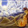
Dragon Valley by @lainburt (Lainey Burton)

dies .....finally finished this pic after coloring toooo many scales... didnt come out how i pictured it would, but it looks good anyway ^-^

Category:
Rating:
Everyone
Class:
Finished Work
Submitted:
20y206d ago
Tags:
None
Other Work By @lainburt

Comments & Critiques (22)

Preferred comment/critique type for this content: Any Kind

Posted: Saturday, 18 October, 2003 @ 07:52 AM

Wow, amazing. ^__^ You did a great job on the scales. How long did it take? A million years? @.o

Posted: Saturday, 18 October, 2003 @ 10:15 AM

Wow, dragon gudness, you did awesoem on the scales and the underscales, I think the dragon's chest luks a little weird tho. I love the fire :)

Posted: Saturday, 18 October, 2003 @ 11:07 AM

The detail on this just blows me away - beautiful painting! I saw the background on the S7 front page and thought it was perfect, but you've made it better. Only got one little nitpick - the dragon doesn't seem to have much depth. That's minor though, the loads of lovely details easily redeem it. :D

Keep it up!! :D

Posted: Saturday, 18 October, 2003 @ 11:24 AM

Wow. Just wow. It looks perfect! The details are all shown (I love the way the slightly ripped wings make it more realistic), and you did an excellent job with the shadows made by the fire!

Posted: Saturday, 18 October, 2003 @ 01:48 PM

Those scales are still oh-so-wicked-awesome! Nice integration of the other colors into them.

Kind of a big nit--and this will probably help you more for future dragon pics than this one--but the way the wrist and hand are coming out of his arm look odd. The scale pattern for the wrist and hand look right, but they just cme otu of the rest in a funny way.

In other news, I really really REALLY love its head--nice blending in coloring there, and I like the tiny dolphin teeth...and I also like the ripped wings!

Posted: Thursday, 20 November, 2003 @ 02:02 PM

OOH. Pretty, cool, awesome, amazing, wow!! I looove the scales and wings and teeth, and the fire, and his eye and not the mention the background!! @_@ is in awe

Posted: Thursday, 27 November, 2003 @ 09:58 PM

Agh, I can see how coloring all those scales would get rather frustrating! But the effect was definitely well worth the effort! This is gorgeous. I really like the fire and the moon in the background. The detail of the two dragons in the distance is nice, too. I wonder what they're doing.. maybe hunting for the third one. His wings look a bit tattered. The sky is beautiful, too, with the stars and nebulae. Overall, I just adore how you colored this whole image! It has an almost ethereal feel to it.

Posted: Monday, 15 December, 2003 @ 03:54 AM

Woow that is soo soo Beautiful i just dies when i see it XD Its lovly !

Posted: Friday, 26 December, 2003 @ 01:23 PM

DANG! Amazing! I thought my Dragon was good. I don't even color mine. But, wow this is good.

Posted: Friday, 13 February, 2004 @ 06:41 PM

wow how long did it take you to do those scales? X.x eekk. =) the backround has good colors to it. Matches the dragon..or dragonS. ^_^ wicked good job

Posted: Sunday, 15 February, 2004 @ 08:43 PM

lol took too long on the scales dies spent a month off an on working on them.

Posted: Friday, 13 February, 2004 @ 08:16 PM

Awesome! ^_^ Looks like we've got the same idea about how dragons breathe fire from a thing under their tongues. Keep up the good work. :D

Posted: Sunday, 15 February, 2004 @ 08:41 PM

hehe yea... thought it was an interesting idea. less burned throat ^-^

Posted: Friday, 13 February, 2004 @ 08:42 PM

O-o HOLYCOW! That is sooo cool. I couldnt ever draw like that in a million years. xD Great work.

Posted: Friday, 13 February, 2004 @ 09:28 PM

o0 Holy sh.....oot. That is AMAZING. This is great. What did you use to color it? The detail is awesome, no wonder it took you a gazillion years to color the scales. I like how you did the background with other dragons flying around. Wouldn't have been as interesting if it was just ONE dragon. Yay for you, you should be proud :3

Posted: Sunday, 15 February, 2004 @ 08:44 PM

used photoshop 6 and my tablet to color it all ^-^

Posted: Thursday, 22 April, 2004 @ 10:07 AM

Please don't die, you must make more beautiful pic's. The fire's good. Love the claws and head and green eyes.

Posted: Sunday, 16 May, 2004 @ 04:04 AM

Wow, that looks like a lot of work... I also have a picture where I had to draw lots of scales, but they weren't nearly as tiny as yours! It looks really awesome. Great job!

Posted: Friday, 18 June, 2004 @ 05:19 AM

WOW! This is a great drawing, i feel very sorry for you having to color all of this in, it must have been indescribably annoying. The coloring is excellent, the same can (and is) said for the background, and shading. I would say, as others have noted, that the arms look kinda "weird," but i believe that is because they are quite thick as compared to the chest. Please don't get me wrong, i luv the picture as is, but I believe u should give the chest a little more width, or thin the arms down in future dragons, to better improve the overall size comparisons and flow of the picture. INCREDIBLE JOB!!!

Sincerely, Ikaika

Posted: Thursday, 22 July, 2004 @ 08:46 AM

OMG!!!! amazing!! the details!!!! faints

Posted: Thursday, 22 July, 2004 @ 11:36 AM

A very lovely piece, The mouth of the dragon turned out great. I like how you decided how the fire should come out, very believable. And of course the scales, I think the ones on the neck are the most successful. Keep up the good work.

Posted: Thursday, 22 July, 2004 @ 01:03 PM

Whoa, that dragon is amazing! Awesome detail! (even though you've heard that quite a few times already :) ) I really like the sky, too.

Leave a Comment

You must be logged in and have an Active account to leave a comment.
Please, login or sign up for an account.

What kind of comments is lainburt seeking for this piece?

  • Any Kind - Self-explanatory.
  • Casual Comments - Comments of a more social nature.
  • Light Critique - Comments containing constructive suggestions about this work.
  • Heavy Critique - A serious analysis of this work, with emphasis on identifying potential problem areas, good use of technique and skill, and suggestions for potentially improving the work.
Please keep in mind, critiques may highlight both positive and negative aspects of this work, but the main goal is to constructively help the artist to improve in their skills and execution. Be kind, considerate, and polite.