@Jansu
Brandon Ballenger

Dancing Girl
Dancing Girl by @Jansu (Brandon Ballenger)

This was just something I whipped up this morning and intended to work on more this evening, but I've really just run into a block on how to progress. The only things I've added just now are the quick background (soft, simple, but hopefully lively?) and the arms. I'm not really liking the positioning of the arms, but this doesn't look as awkward as the other things I tried earlier, so for this version this will do.

I hope to work on this more at some point, but like I said, I don't know where I'm going with it. It started as a simple doodle and might not progress much beyond that.

Category:
Rating:
Everyone
Class:
Work-In-Progress
Submitted:
19y249d ago
Tags:
None
Other Work By @Jansu

Comments & Critiques (5)

Preferred comment/critique type for this content: Any Kind

Posted: Tuesday, 07 September, 2004 @ 06:06 PM

Oooooooooooh, pwetty! It's such a soft, beautiful image... The background is so nice and pastel-y! You always make such neat backgrounds... ^-^ The hair looks so real, too... You can practically see the individual strands! It was a nice touch to leave the girl barefoot, too, and you chose a perfect skin tone to fit the softness... I don't see any problems with the arms actually--it's actually a pretty charming pose!

The only place I see that might need a little more work is the dress... The colors and design are purty, but there's a few little awkward bits, like above her right arm... I'm not sure if that's a puffy sleeve or her chest... If it's a puffy sleeve, the puff is more pronounced above the shoulder and comes close to the arm at the bottom of the sleeve... And if it's her chest, her breasts wouldn't stick out that far... Torsos aren't really that thick. The bottom, where the colored bands are, looks a little flat instead of part of a roundish dress. A little more shading and/or highlighting should probably help that.

Pwetty pwetty picture! I'm looking forward to the final product--I'm sure it'll be even more beautiful!

Posted: Tuesday, 07 September, 2004 @ 06:13 PM

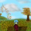
It is her chest, but not the whole thing. It's an awkward pose as usual, and my shading didn't make it very clear. On the other hand, I do agree that it sticks out a bit much, but if I shorten it any there won't be any signs of a chest at all. Oh well, perhaps it's necessary with the pose. Agreed that it does make the torso look thicker too.

Those aren't bands - they're layers. Yes, they look flat, and that's the primary problem, why you can't even tell that they're layers. If you'd seen the photo you would've known, but I didn't think it would be very clear otherwise either. Like I said to you directly earlier, I'm not really sure how to work with those layers, the shading of them (you thought I meant Photoshop layers, huh?).

Posted: Tuesday, 07 September, 2004 @ 06:35 PM

Ooooooooooooooh, dress layers! Iiiiiiiii get it now... ^^;;;; For that, I would say have shading at the top of each dress layer except the top one, to give a feel that what's above it is separate and a bit further out.

Ah, I think I understand what you were going for with that pose now... She's supposed to kind of be posed with her chest out a little and tilting back a bit, kinda elegantly...? Uh, that's the only way I can think of to describe the pose I'm thinking of... ^^;;; Um, actually, for something like that, you may want to put her chest a little higher than where it is to give that illusion...

Now that I think about it and look at the placement of the highlighted folds, is that a flamenco dress...?

Posted: Tuesday, 07 September, 2004 @ 09:30 PM

There isn't much I can add to what Nadia said...... So, I'll just say that it looks good and it shows some real growth in your skills. But alas... That's all I can say since Nadia went and hogged everything I could've said! ;_;

Posted: Wednesday, 08 September, 2004 @ 08:17 AM

Ah, this is great!

I have only one complaint about this, and you & Nadia have already addressed it -- the chest area. Although it wouldn't be the pose you originally had in mind, if all the fuschia on the right side of her arm was gone, the proportions would look just right.

Okay, now for the good stuff! First of all, I love the background. It makes me think of A) a shoujo/anime fantasy sequence, and B) West Side story. It gives just the right dreamy, glowing quality to the image and the colors are very pretty without taking anything away from the foreground. I really like the pose -- other than the chest, the proportions look great, and the combination of pose & dress positioning give the impression of twirling. (in fact, this image looks very impressionistic overall) The skintone, hands, and the pointed foot are all excellent touches. The dress looks good -- the colors reflect the Latin music influence, but they aren't flashy enough to detract from the softness of the image. The blurry edges at the bottom add to the sense of motion. Finally, this might be reading a little too much into it, but I find the girl's messy hair really interesting. Like...maybe she's European (when I was in Europe I saw VERY little blowdried hair...the look was very "natural"), or perhaps she's been dancing a long time.

Lovely image, Janus!

Leave a Comment

You must be logged in and have an Active account to leave a comment.
Please, login or sign up for an account.

What kind of comments is Jansu seeking for this piece?

  • Any Kind - Self-explanatory.
  • Casual Comments - Comments of a more social nature.
  • Light Critique - Comments containing constructive suggestions about this work.
  • Heavy Critique - A serious analysis of this work, with emphasis on identifying potential problem areas, good use of technique and skill, and suggestions for potentially improving the work.
Please keep in mind, critiques may highlight both positive and negative aspects of this work, but the main goal is to constructively help the artist to improve in their skills and execution. Be kind, considerate, and polite.