@mooch
Jessica A. Kadikoff

Self Portrait 2 - Battle Royal NL
Self Portrait 2 - Battle Royal NL by @mooch (Jessica A. Kadikoff)

2nd attempt at lineart and found a kickass coloring Tutorial. I likes my eyes o.o

I have a sword because of a battle thinger going on at NL atm.

Category:
Rating:
Everyone
Class:
Finished Work
Submitted:
17y176d ago
Tags:
None
Other Work By @mooch

Comments & Critiques (5)

Preferred comment/critique type for this content: Any Kind

Posted: Monday, 13 November, 2006 @ 12:40 AM

It's an interesting perspective, but also a very difficult one and there are a few things about it that aren't quite right. The head, torso and skirt have worked out well, but you've exaggerated the amount the arm gets smaller as it moves back, I think, so it looks like the hand is as far away as the foot. The leg works a bit better, but I think it's a bit too far to the right and doesn't quite look like it connects. It may also be too small, as well. It is a very challenging perspective, though, and I think you've made a very good attempt.

I really like the way you've done the eyes; there's a lot of depth in them, and I love the colour choice. I think the eye on the left is a bit too low, though, but I didn't notice until I really looked (and turned my head to the side and hurt my neck, so I don't imagine it's much of a problem ;) )

Great work, anyway; it isn't often anymore that an artwork catches my eye enough for me to comment :) (I've gotten a bit lazy... lol)

Posted: Monday, 13 November, 2006 @ 07:35 AM

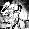
My hip is turned, making the leg proportionate to my body but the skirt hides that fact.

I'm supposed to be leaning backwards, so my arm would reach that low though I agree I think it's a bit long.

And based on the reference I used, the eyes seem perfectly fine to me.

I think you were nit-picking a bit there without realizing the pose I was trying to accomplish. It's supposed to have that zoomed in effect, and of course everything that is farther away is going to be severely exaggerated to accomplish a sort of "fisheye" type effect.

Posted: Tuesday, 31 July, 2007 @ 05:48 PM

ok, i have quite a lot to say on this. i got an account on side 7 just so i can say it. when i first saw this picture, i thought: wow. its a really cool picture and the perspective is kickass, lol. i looked at it for a while and read the comments, and it took me a while to work out all of the perspective and everything. after i read anrui's comment, where he/she pointed out the arm and left eye, i could see that they were the tiniest bit off. the arm, i suppose, is a little exaggerated as it gets smaller, but its not horribly noticeable or anything. after looking at the eye, im not completely sure if its right or wrong, because when i looked after reading the comment it does seem a little low down, but then i looked again and it could just be the way the face is shaped and the expression... i cant quite work it out properly. well overall, i love this piece, and i could never achieve anything anywhere near as good as this, (tho i gotta say that even if the dude was nit-picking, it means the position you were trying to portray was not easily realized, so this is something you could improve?) ok, i've said a lot. hm, OH YE! if its an online tutorial, can you please give the link? and any links to any tutorials, because i have a long way to go. final note, YOU ARE AWESOME! i would worship you, but i'm a christian and that would be blasphemous. ;P

Posted: Wednesday, 24 October, 2007 @ 12:38 AM

thanks! im glad you like it so much ^^ As for the tuts I lost the links for them, but i just searched on google and found them, so it was quite easy. I do this stuff freehand now, lol. Oh and dont worry, I made your post public ^^;;

Posted: Wednesday, 01 August, 2007 @ 07:10 AM

i swear i put it as a public comment!!! ah well, it went to private....

Leave a Comment

You must be logged in and have an Active account to leave a comment.
Please, login or sign up for an account.

What kind of comments is mooch seeking for this piece?

  • Any Kind - Self-explanatory.
  • Casual Comments - Comments of a more social nature.
  • Light Critique - Comments containing constructive suggestions about this work.
  • Heavy Critique - A serious analysis of this work, with emphasis on identifying potential problem areas, good use of technique and skill, and suggestions for potentially improving the work.
Please keep in mind, critiques may highlight both positive and negative aspects of this work, but the main goal is to constructively help the artist to improve in their skills and execution. Be kind, considerate, and polite.