aight i edited these with a drawing app so some elements will look weird lol but it’s just to explain the idea better,,,,
basically add a sidebar to clear the top bar and get rid of the “browse” and “fun” buttons, add a huge submit button to make being able to post faster and easier, right now i feel like new users who are not accustomed to the site might get confused on how to post things, i added the credit store on the side bar to give it more visibility, this way new users might get a hang of credits faster too, i recently found out about the credits system just because Thorvald mentioned it to me on a comment,, and i’ve been here for more than a year XD
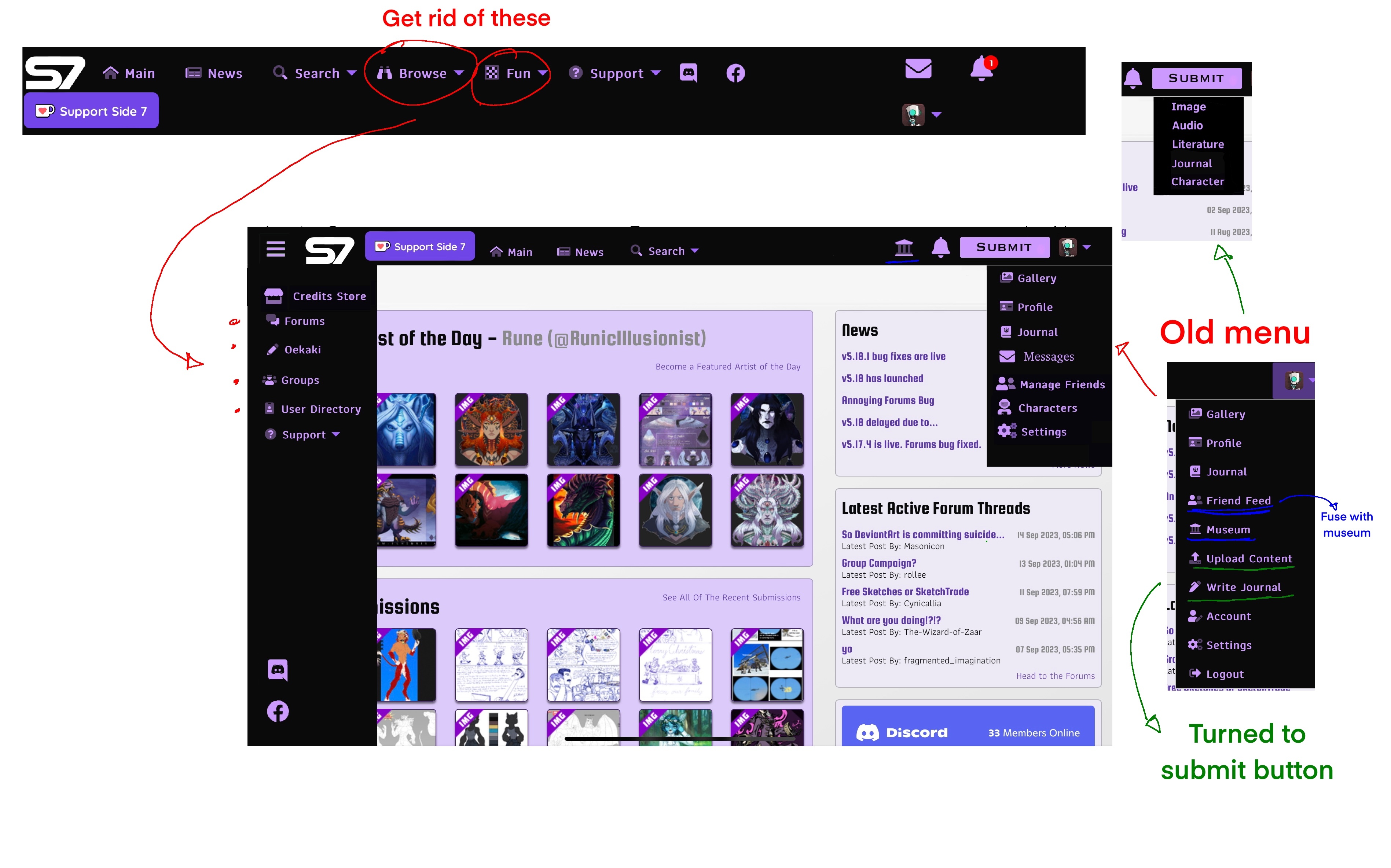
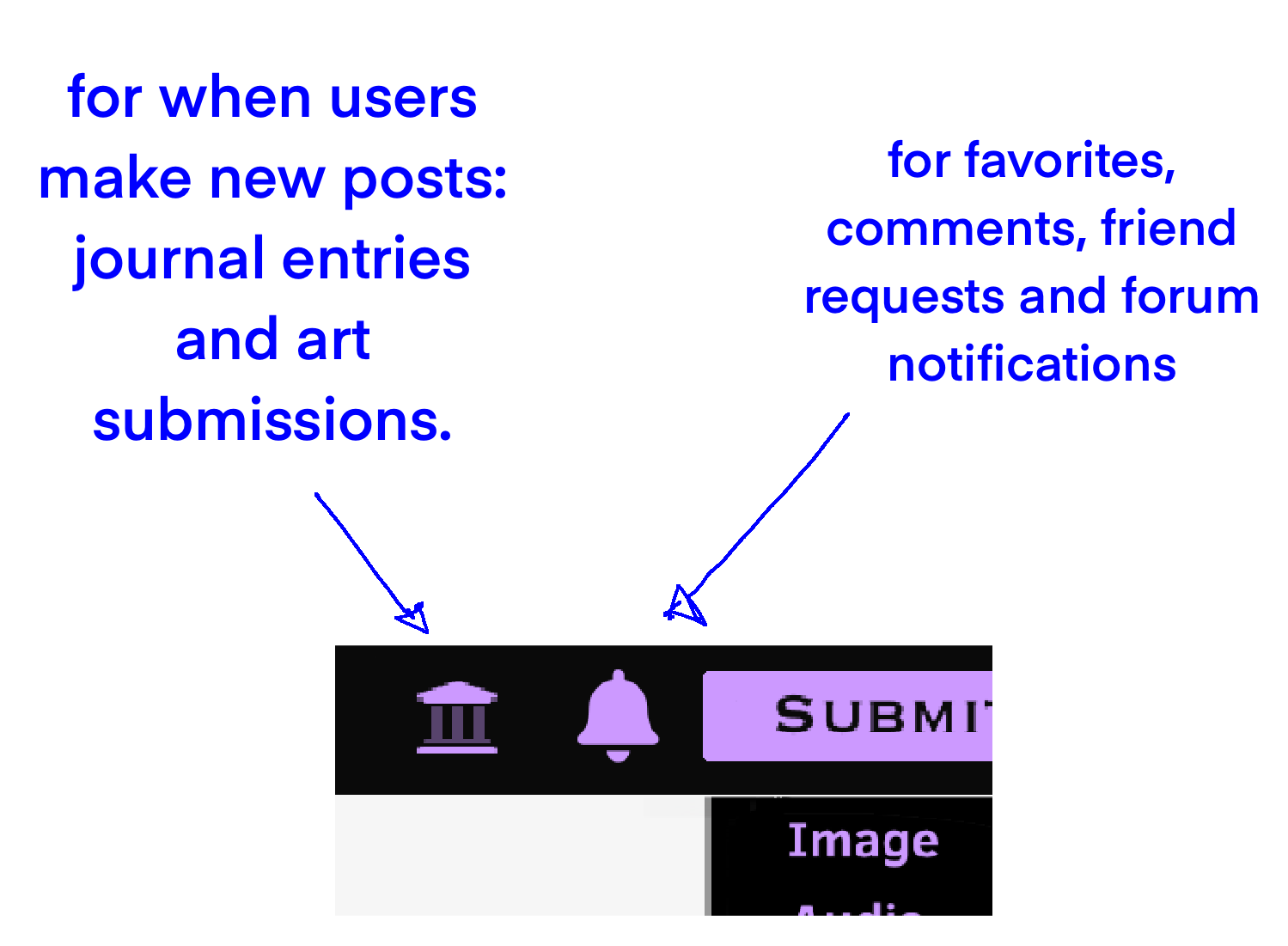
i put a button for the museum on the top bar too,,, i know the notification system is in the works, one of the issues with the current system is that it can get spammy when users upload multiple things a day, and this is where i think the museum can help with that, so, split the notifications, museum for other users uploads and the bell for likes,comments and forum posts.
also i believe the museum could get a redesign? honestly i never use it because,, well, the notifications already tell me what users have uploaded and it takes away the need to check it
i almost forget to mention - but the friends feed could get fused with the museum, currently the user menu has the friends feed and museum button and more buttons make the site look cluttered and a bit confusing (atleast for me)
instead of having the notification list saying “user has uploaded a journal”, “user has uploaded a new piece”
it could be this instead: the museum button gets that small icon with the number of new posts, then on the museum page the newest posts will have an indicator that they have not been seen by the user, maybe a different border color, a small icon on a corner,,, idk i haven’t thought of it-
also it would be great if we had the option to look at an user’s submissions as stacks
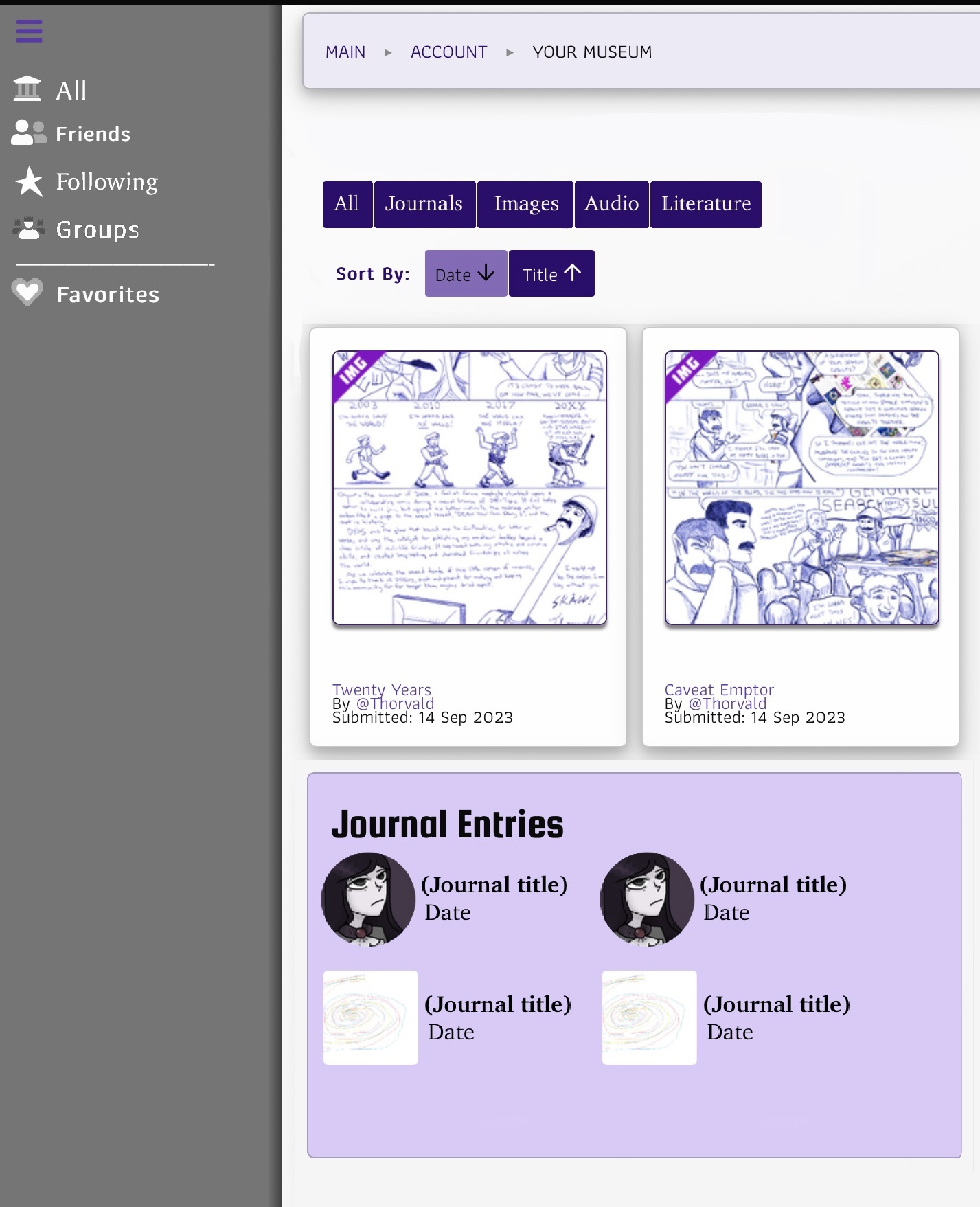
i’ll take deviantart as an example for stack display, when an user posts, say, 4 images it will show in the feed as only the most recent one, but upon hovering it tells you how many recent entries there are, you click on it and it shows all the newest art from that user
Page 1 of 1 :: Viewing 1-3 of 3
site UI and museum suggestions - Started by: Camazotz
site UI and museum suggestions
Posted: 15 Sep 2023, 07:18 AM
This post has been edited 2 times. Last edit on 15 Sep 2023, 07:28 AM.
RE: site UI and museum suggestions
Posted: 15 Sep 2023, 12:19 PM
This is amazing. Thank you for taking the time to do this, especially the illustrations. It definitely gives me something to ponder and consider. Not all of the suggestions are simple changes; some are changing fundamental functionality of the site. But, this is absolutely something I will give serious consideration to. Thank you!
-- BK
RE: site UI and museum suggestions
Posted: 15 Sep 2023, 09:34 PM
First of all, mad props for providing mockups.
I like a front-line Submission button, and shortcuts to the specific categories would definitely be handy (but will require back-end changes; I checked). Separate notification tracks for actual uploads versus correspondence is most welcome. I would suggest maintaining the 'Messages' button (and decouple DMs from what are basically redundant notes every time one comes in).
Whether the Museum and Friends Feed should be literally merged may warrant a poll to see how people are currently using them, and/or depend on whether expansion of their features are planned down the road that would make discrete galleries purposeful.
Quick-sort by type as in Recent Submissions is an instant yes. We definitely need more ways of curating journals, both as watchers and general browsers like on the full upload index: certain people are rather prolific posters and I couldn't respond to a journal before it got pushed off the front page and I forgot the username. A toggle for stack display would certainly be handy for those that prefer it.
I would keep the 'Support' menu on the main ribbon, but also copy it to the sidebar for ease of access: even as someone who knows the procedure by rote, DeviantArt's efforts to virtually bury its contact page is a severe vexation. S7 may actually be the first site I've seen that puts its policy links somewhere that's quick to access wherever you are.
Page 1 of 1 :: Viewing 1-3 of 3