@Jansu
Brandon Ballenger

Dancing At the Beach
Dancing At the Beach by @Jansu (Brandon Ballenger)

A lot more of the smudging/fingerpainting. I decided to do a beach. So that's what I did.

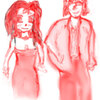
I also decided to bring in Dancing Girl and touch her up a bit. I attempted to correct the...ahem...breast issue and made a few minor changes in addition to that just to make it fit with the scene a bit more.

I redid the sky for this image three or four times. I didn't want it to be entirely congruous; I also wanted a few different kinds of clouds. But things were looking so drastically different I kept redoing it. I'm not wholly satisfied with how it looks now, but I'm not willing to touch it again right now.

The water could probably use more detailing, but this image has ambient light more than anything else, so I kept it to a minimum.

My sister thinks the sand looks like snow and that my waves look like icebergs. I disagree. But I see where she's coming from.

Overall, I like it.

Category:
Rating:
Everyone
Class:
Finished Work
Submitted:
19y197d ago
Tags:
None
Other Work By @Jansu

Comments & Critiques (4)

Preferred comment/critique type for this content: Any Kind

Posted: Friday, 29 October, 2004 @ 01:07 PM

It's the return of Dancing Girl, and she has an even prettier background! I see you fixed up the chest area from last time, but I wonder if perhaps you removed too much...? It seems like there should be SOMETHING to the right of her arm... Just a small little bit, and perhaps some sleeve... As it is now, it almost looks like her arm isn't connected to her body...

The sky is so lovely... I like how you managed to put different types of clouds in the sky, especially those really faint, wispy ones... And the clouds have such beautiful shading to them... The purple is a perfect shade for that...

I think the water looks just fine as is... It doesn't really need any more detail in my opinion, either... I don't really see the waves as icebergs, but they don't QUITE look like waves, either... I think waves have a lot of frothy white to them, especially when they crash down... I think if they were more white and puffy (in a different way than the clouds), that might help a little...

As for the sand, I disagree with your sister again... It does look pretty sandy, and I like how you painted it to look shaped by the water (ie. not smooth... I'm sure there's a word for it, but I can't think of it... ^^;;; )... However, it looks kinda like she's up on a cliff looking down than at the water's level... The water would be more transparent closer to the sand, and you'd be able to see the sand below, or at least there'd be a little frothy whiteness at the water's edge... I can see a little transparency at the left, but I think there would be quite a bit more all over...

Really, this is a very pretty and nifty image, and I like that you're trying all these neat, new things! Just keep working at it! Now that you've done Dancing Girl, I'd like to see even more dynamic images from you! ^-^

Posted: Friday, 29 October, 2004 @ 01:20 PM

LOL...okay, I can touch her chest up again, I suppose...

The sand she's standing on is in fact "raised" above sea level; she's not standing right next to the shore. It slopes down in much the same way it does at the beach near here. So tat's not a mistake on my part, I actually didn't want to try and attempt the transparent water bit, and I would've had to change the angle as well, which I didn't want to do...so.

Thank you!

Posted: Saturday, 30 October, 2004 @ 03:27 AM

This looks more like something off a canvas than finger paints... :p The way you handle your colors and such, I'd say you'd have a great future as a legitimate painter. Though the sea doesn't look as smooth as it probably should (I DO see iceburgs, but not before you brought it up), I love what you did with the sand and sky. The sand has that wonderful wind-blown duny effect that I could probably NEVER duplicate (note to self, don't draw sand--EVER) and the sky.... Well, the sky looks tranquil and soothing. The girl ain't bad either though I'm noticing that her limbs are too skinny for her waist and stuff... That's not a bad thing, but it makes her look like a Lupin character--but even still, it's a LOT better that I probably could've done when I started drawing. Overall, it's a very tranquil, peaceful picture that continues to hint at your growing skill! ^^

Posted: Friday, 10 December, 2004 @ 03:44 PM

Ooooh....very pretty! I really like how you chose a daytime environment -- the blues contrast nicely with the girl's bright dress. Most specific comments I had have already been said, but I do think the waves look like waves, and I understood that the water is not supposed to be touching the sand she's standing on. Overall I think this is great, but I dislike the color of the sky. I don't think I've ever seen a sky that color, and it kind of clashes with the water too. Also, the sky might have more depth to it if it's more than one flat color - usually a simple gradient can do the trick, especially since you have those nice clouds. Good work!

Leave a Comment

You must be logged in and have an Active account to leave a comment.
Please, login or sign up for an account.

What kind of comments is Jansu seeking for this piece?

  • Any Kind - Self-explanatory.
  • Casual Comments - Comments of a more social nature.
  • Light Critique - Comments containing constructive suggestions about this work.
  • Heavy Critique - A serious analysis of this work, with emphasis on identifying potential problem areas, good use of technique and skill, and suggestions for potentially improving the work.
Please keep in mind, critiques may highlight both positive and negative aspects of this work, but the main goal is to constructively help the artist to improve in their skills and execution. Be kind, considerate, and polite.