@VerseOfDreams: Thank you.

Batum Fonts - Kavtedagh One and Two by @fragmented_imagination (B Sanders)
Spent the day putting these together. Well, one I put together; the second one is mostly a clone.
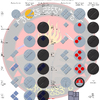
These are Kavtedagh ("square logo') fonts. Their main feature is that the body of each character is molded into a square shape. The letters are hollow and arranged so that they share boundaries with one another so that a whole word looks like a large block. As the name suggests, these are fonts used for logos, mostly company logos or even fonts for book or television show titles. The top font is the basic font. The bottom font, which is a copy of the top font, looks almost the same except that the letters' outlines form a whole square rather than have the clipped corners of the top font. Both fonts are meant as outlines and are usually filled with a secondary color so that the logo stands out. While considered stylish, it comes at the cost of readability; many of the letters are only distinguished by a few lines, forcing anyone reading the logo or title have to pause just to make sure they understand the whole word.
Just like this piece, the fonts are arranged with basic letters on top, vowel diacritics and combined consonants in the middle, and sentence and title brackets and numbers on the bottom.
© 2023 B Sanders
Category:
Rating:
Everyone
Class:
Finished Work
Submitted:
198d4h ago
Tags:
Comments & Critiques (3)
Preferred comment/critique type for this content: Any Kind
Average Rating:
(5)
Average Rating:
(5)
Posted: Sunday, 15 October, 2023 @ 05:51 AM
@fragmented_imagination: Anytime.
Awesome.