
@Thorvald: I have found that writing them by hand first helps with appearances. Most of my conlangs start as handwriting in a notebook, even the ones that don't have their own writing system.

Batum Fonts - Ghennu and Abhsiyzh by @fragmented_imagination (B Sanders)
Spent almost two whole days designing these based on some pen work I did a couple of weeks ago. So, in addition to a base font, Batum now has two more stylish fonts to use.
The Ghennu font is a standard calligraphic script used for regular formatting in a similar manner to Times. It is commonly seen in most documentation. The Abhsīzh font is a stronger style of calligraphy with connecting letters (the image above has more space between the letters to show their whole form). It is a regular font for headers and titles. It emphasizes the main stroke of each letter and curves the bodies of the letters to make the transition to the tail smooth.
The groups are arranged:
- Consonants
- Vowel diacritics, long consonant ring, and combined consonants
- Sentence and title brackets and numbers
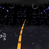
I added the ALRB to at least give a background that the letters could be visible against.
© 2023 B Sanders
Category:
Rating:
Everyone
Class:
Finished Work
Submitted:
1y29d ago
Tags:
In These Portfolios
Comments & Critiques (2)
Preferred comment/critique type for this content: Any Kind
I love how these are familiar enough to evoke real-world script but divergent enough to telegraph they're original.
As someone who struggles to work in pure abstraction, I always wonder how people come up with these. (*/ω\)